Creating cut through advertising requires a client who dares to be different.
If you’ve ever seen architects advertisements you’d notice that with the exception of the logo they all follow the same exact formula. Big hero project image (typically in black and white because it looks more sophisticated) and white text knocked out of a black background (again, looks more designery and obviously sophisticated).
You must have a trusting client to be able break through the cliché and do something different.
Luckily, we have such a client.
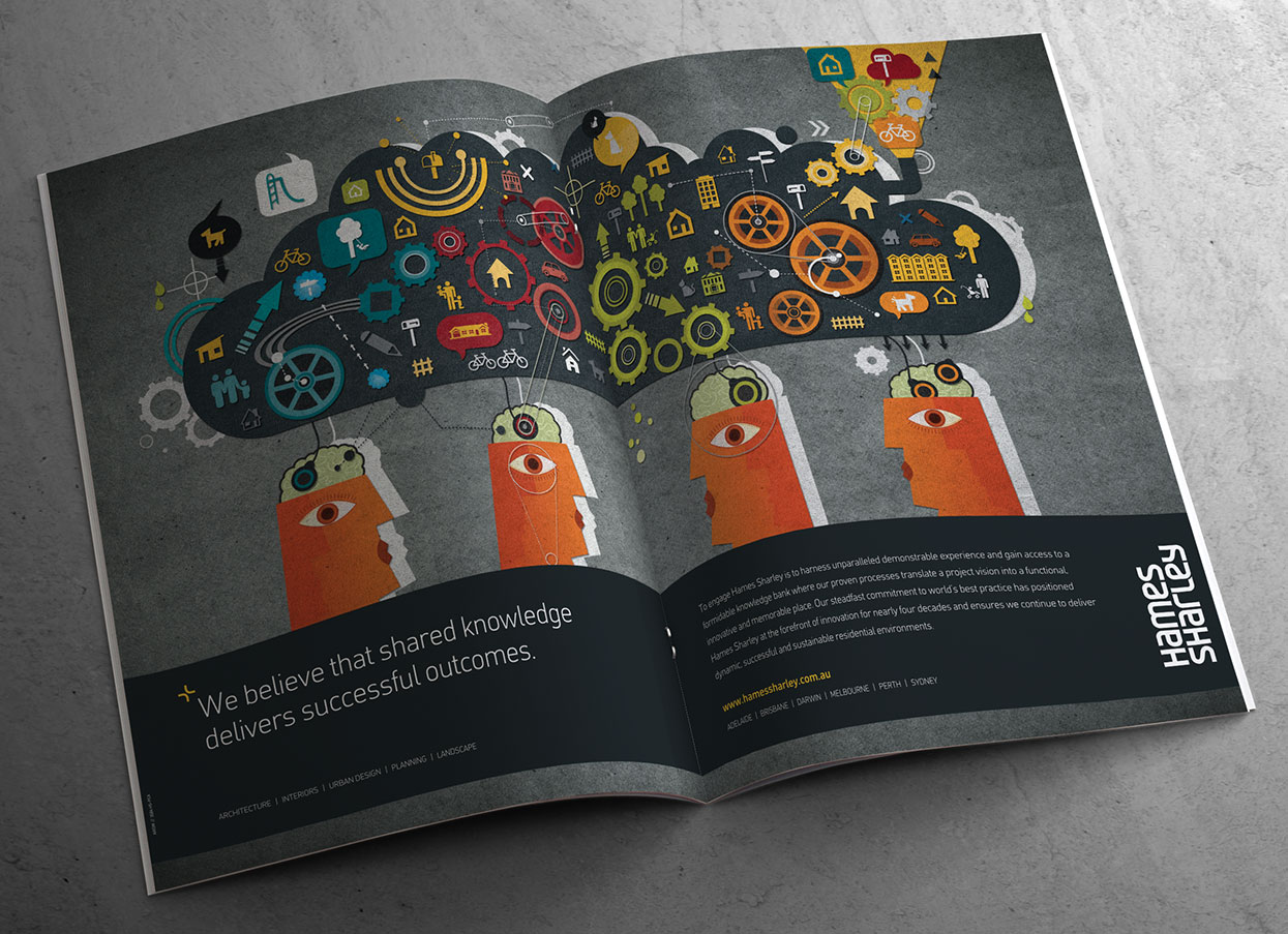
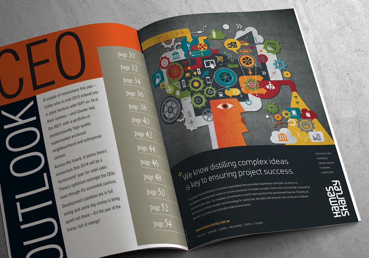
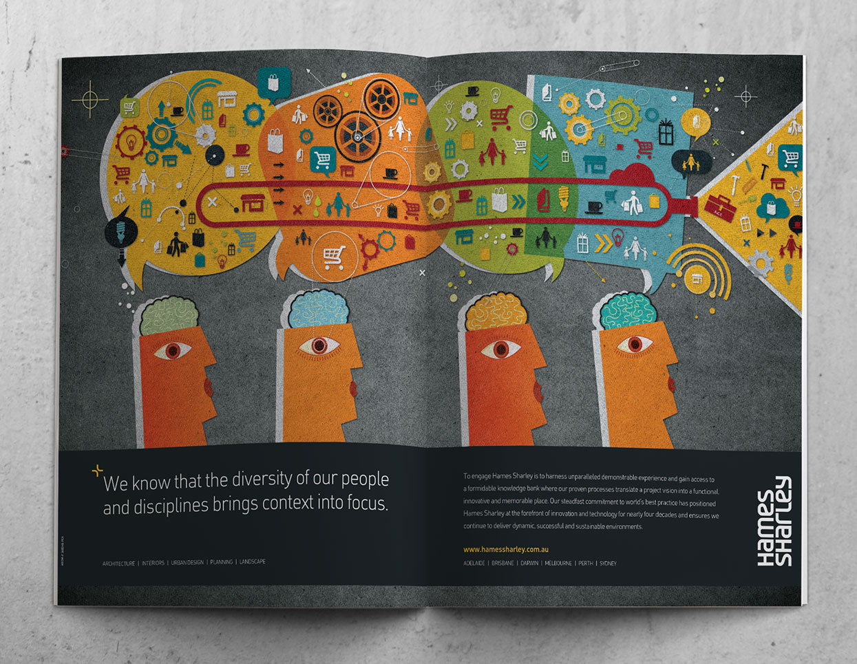
We provided example after example of what their sector typically does and encouraged them to ‘think like a client’ to ‘see what they see’. Sure, pretty pictures of projects look good, but by themselves don’t say much. They don’t enlighten a client as to what outcomes the project delivered for the client, to do that we need to entice them to visit your website.
To do that the advertisement must: 1) Be noticed. 2) Be compelling or take the reader on a journey. 3) Be consistent in how you look and what you say. And you don’t do that by looking just like everybody else.